
In a previous article I wrote about my experiences building out shield.nvidia.com. One of the major factors with the buildout was the launch date. As such I wanted to go back and optimize the site. For me, optimizing a site is not something you do once and forget about (at least it shouldn’t be). The fact is that browsers are in constant flux. Now though this may be seen as chaotic in some ways, but it's also what pushes the platform forward. An optimization today could very well turn into a bottleneck tomorrow. So the key takeaway here is ABO "Always Be Optimizing".
So much goes into frontend engineering and you might find yourself asking: "So where does the optimization process actually start?". Keep in mind there is more than one way to "Skin a Cat", and the same applies here. I'll go into some detail about my approach for this specific project.
 I fire up good old chrome, and open the network panel. Now I navigate to shield.nvidia.com. Before I even check the requests/size, what do I notice on the site itself? Images slowly loading on the page. As a casual user, I might not notice it or complain about it, but definitely something as a web developer I notice and want to fix. Not to mention, I am browsing the site on the company's internal network at the moment. We have a fast connection and needless to say not everyone that visits the site will.
So in the network panel I click to sort by "Duration" and its quite obvious that I need to do something about these images. Lets take one and work with it, "shield-cover-open.png" is a fine choice. Why you ask? It was one of the larger images. So what do we know about this image? Its of type png, its about 672 KB, and the dimensions are 1920x1080. It is part of the image gallery.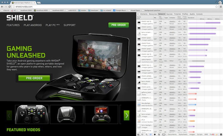
Since its a picture and doesn't have transparency, we can convert it to a jpg file which will reduce the file size a great deal. When I do this my eye can't really notice a difference but the file size has been reduced to 205 KB. Thats a difference of 467 KB or 106.5%. Great, I'll take it! Now I just need to apply that to the rest of the images. In this case I have about 8 or so and don't want to do this manually for each one. I use a Mac and have ImageMagick installed. It has a handy command line tool 'convert' (you may want to google "batch convert png to jpg" and find a solution that suits your development environment). So I change into the directory and run the following from the command line:
for file in *.png; do convert $file ${file%.png}.jpg; done
Quick tip: Summing size of a list of images (or any file type for that matter)
ls -ls *.jpg | awk '{ sum += $6 } END { printf "size: %.2f MB\n", sum/1048576 }'
This will convert all .png files in the current directory to .jpg. I've reduced the total size from: 6.56 MB to 1.54 MB. Now I just have to change the src attribute of my img tags in the markup. This should dramatically reduce the amount of time it takes to download these images and your users on a slower connection won't hate you as much.
Ok so what about the images on the page that you can't convert to jpg. For those lets run them through a tool to compress them a bit more. I use 'pngcrush' but I am sure you can find a similar tool for your development environment.
for file in *.png; do pngcrush -reduce -brute $file crushed-$file && mv crushed-$file $file; done
This takes the the pngs in the image directory from: 6.01 MB to 3.61 MB. Since we're replacing our existing png files and not creating new ones, there is no need to change anything in our markup.
The last thing I want to do in regards to images is find any that can be combined/sprited. There are several ways to determine this, I'll use a bookmarklet tool called 'SpriteMe' to get an idea of what it thinks should be a sprite. It even goes a step further and creates the sprite along with the css.
When I first run this, it shows 3 images that can be sprited. This is taking the current context into account only. By that I mean "What if you were viewing the site on a tablet and some content is either shown or hidden?". In fact depending on the size of the screen I am showing/hiding a mobile version of the top navigation that includes images.'SpriteMe' to get an idea of what it thinks should be a sprite. It even goes a step further and creates the sprite along with the css.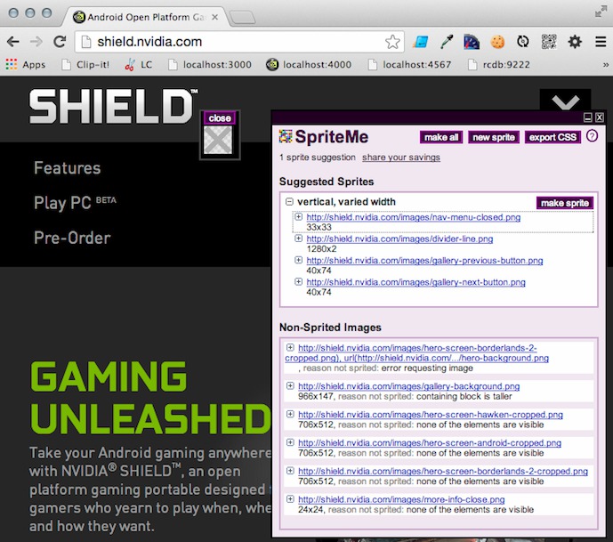
So you'll either want to involve the creative team (if you have one) or use photoshop and create it yourself. Another option, and the one I'll use here is to let Compass generate the sprites for me.
I am going to start with the gallery navigation (next & previous) buttons. So I create a folder for that sprite called "gallery-navigation" within the images directory. Next I add the following to my sass file:
@import “gallery-navigation/*.png”;
Then I include the next and previous buttons like so:
  .next { @include gallery-navigation-sprite(gallery-next-button); right: 0; }
  .previous { @include gallery-navigation-sprite(gallery-previous-button); left: 0; }
Sure spriting 2 images is only one less request but I'll take a few small wins where I can. Lets apply the same technique but this time to the menu open/close toggle images that are shown when we're on a tablet/phone. We can also add the "back to top" button, which is another mobile only image. Now we went from 5 requests to 2. What else can we sprite! Word of advice, just because you have this new shiny hammer, doesn't mean everything is a nail waiting to be struck.