The Box Model
Before we begin, please open a browser window and navigate to the Code Pen Site.
When the browser renders a page, it creates a rectangular box for each DOM element. This box is made up of the content (image, text, video, etc…), and optional padding, borders & margin. These boxes are than laidout on the page according to the styling rules that govern the DOM element. DOM elements are displayed as either block or inline.
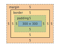
(Box Model as seen in chrome devtools)
element.style {
  border: 5px solid;
  height: 300px;
  margin: 5px;
  padding: 5px;
  width: 300px;
}
DOM Elements
Lets talk about the types of DOM elements, and how they relate to the Box model.
Block Elements
A block element will take up the full width available for the line its on based on the width of its parent element. DOM elements before and after it are pushed to separate lines. Take a look at this codepen for some examples of blocks: http://codepen.io/mweppler/pen/psqhF
divs:
  <div>Division</div>

headings:
  <h1>Header 1</h1>
  <h2>Header 2</h2>
  <h3>Header 3</h3>
  <h4>Header 4</h4>
  <h5>Header 5</h5>
  <h6>Header 6</h6>

lists:
  <ol>
    <li>List Item 1</li>
    <li>List Item 2</li>
    <li>List Item 3</li>
  </ol>

  <ul>
    <li>List Item</li>
    <li>List Item</li>
    <li>List Item</li>
  </ul>

paragraphs:
  <p>Bacon ipsum dolor sit amet ham chuck bresaola...</p>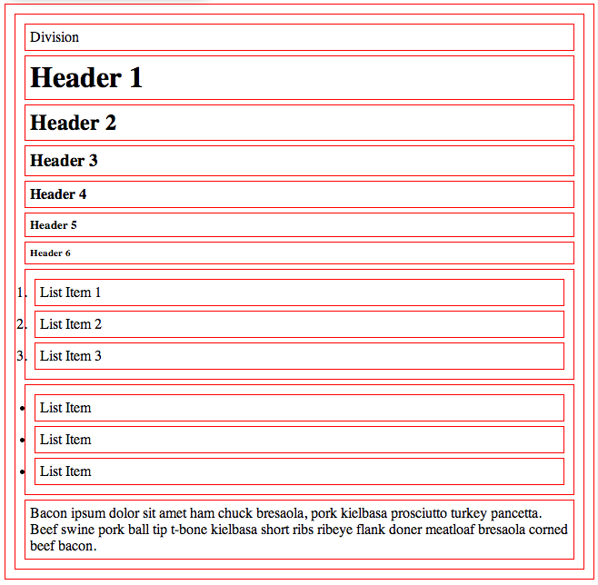
(Block Elements)
Inline Elements
Inline elements take up as much width as they need and nothing more. They do not create any newlines and they stay in line with the rest of the DOM elements on that line. Take a look at this codepen for some examples of inline elements: http://codepen.io/mweppler/pen/Gqtky
anchors:
  <a href="#">Anchor</a>

images:
  <img src="#" />

spans:
  <span>Span</span>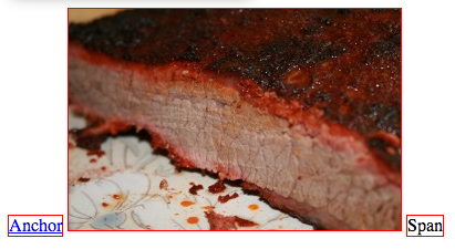
(Inline Elements)
Padding, Borders & Margin
Padding, borders & margin are added around the DOM elements content. The padding property creates space on the inside of the box, around the content. The border property creates a border around the box. The margin property creates space on the outside of the box. Something to note is that you can apply a pixel or percentage value but it cannot be a negative value (except with margin).
Padding
element.style {
  padding: 5px; /* shorthand for: */

  padding-top: 5px;
  padding-right: 5px;
  padding-bottom: 5px;
  padding-left: 5px

  /* you can add more than one value to the padding property, they are applied in the order above: */
  padding: 5px; /* applies to top, right, bottom, left */
  padding: 5px 5px; /* applies to top & bottom, right & left */
  padding: 5px 5px 5px; /* applies to top, right, bottom */
  padding: 5px 5px 5px 5px; /* applies to top, right, bottom, left */
}
Border
element.style {
  border: 5px solid #000; /* shorthand */

  border-width: 5px;
  border-width: 5px 5px 5px 5px;
  border-style: dashed; /* styles include: dashed, dotted, none & solid */
  border-color: #000;

  border-width: 5px 10px 15px 20px;
  border-top-color: green;
  border-right-color: yellow;
  border-bottom-color: blue;
  border-left-color: red;
  border-top-style: dashed;
  border-right-style: dotted;
  border-bottom-style: solid;
  border-left-style: none;
}
Margin
element.style {
  margin: 5px; /* shorthand for: */

  margin-top: 5px;
  margin-right: 5px;
  margin-bottom: 5px;
  margin-left: 5px

  /* you can add more than one value to the margin property, they are applied in the order above: */
  margin: 5px; /* applies to top, right, bottom, left */
  margin: 5px 5px; /* applies to top & bottom, right & left */
  margin: 5px 5px 5px; /* applies to top, right, bottom */
  margin: 5px 5px 5px 5px; /* applies to top, right, bottom, left */
  margin: auto; /* allows the browser to calculate the margins */
}
Figures
Lets take a look at some examples, open a new code pen and add the following:
HTML
<span class="box">1</span>
<span class="box">2</span>
<span class="box">3</span>
<br />
<span class="box">4</span>
<span class="box">5</span>
<span class="box">6</span>
<br />
<span class="box">7</span>
<span class="box">8</span>
<span class="box">9</span>
CSS
body { margin: 0; margin: 5px; padding: 0; }
.box {
  background: #76b900;
  border: 1px solid black;
  display: inline-block;
  font-family: monospace, sans-serif;
  font-size: 5em;
  margin: -2px;
  padding: 0;
  text-align: center;
  width: 92px;
}
.border-10 { border: 10px solid black; margin-top: 1px; }
.padding-10 { margin-top: 1px; padding: 10px; }
.margin-10 { margin: 10px; }
You should see something that looks similar to the follow:
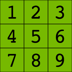
(No margin, padding, borders)
Now lets add the class ‘margin-10’ to the 5th span element:
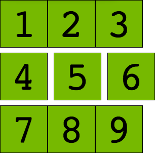
(10 Pixels of Margin)
Remove the ‘margin-10’ class and add the class ‘padding-10’:
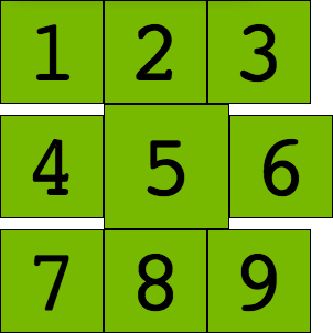
(10 Pixels of Padding)
Remove the ‘padding-10’ class and add the class ‘border-10’:
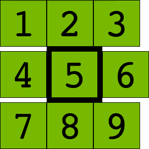
(10 Pixel Border)
Lets see how margin and padding work with each other, remove the ‘border-10’ class and add ‘margin-10 padding-10’:
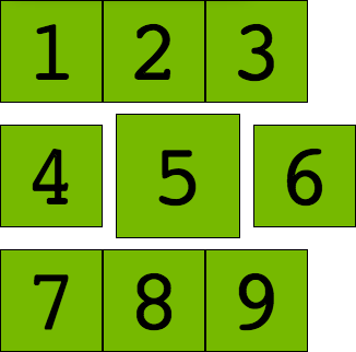
(10 Pixels of Margin & 10 Pixels of Padding)
Remove the ‘padding-10’ class and add ‘border-10’:
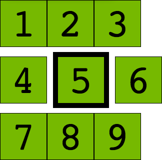
(10 Pixels of Margin & a 10 Pixel Border)
Remove the ‘margin-10’ class and add ‘padding-10’:
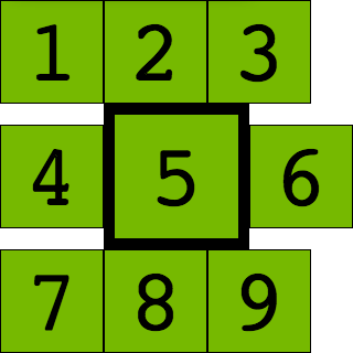
(10 Pixels of Padding & a 10 Pixel Border)
Lastly, lets add all three classes ‘margin-10 padding-10 border-10’:
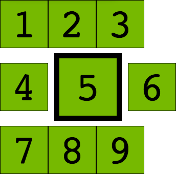
(10 Pixels of Margin, 10 Pixels of Padding & a 10 Pixel Border)
Display, Visibility, Height & Width
Display Property:
The display property allows you to override the default display settings of an element.
element.style {
  display: none;
}
Display property values include:
- block: if the default for block elements and creates a block around the element adding a newline before and after it
- inline: if the default for inline elements and places the element in the flow of the line
- inline-block: generates a box that is a block element flowed with surrounding content as if it were an inline element
- none: removes the element from the page layout (not the DOM)
Update the code pen and add the following css:
.display-none { display: none; }Now remove the ‘margin-10 padding-10 border-10’ classes from the 5th span element and add the ‘display-none’ class. You should see something similiar:
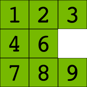
(Display None)
In order for width and margin properties to have an effect we need to add a display of inline-block to the element (note that negative values cannot be applied).
element.style {
  display: inline-block;
  margin: 5px;
  width: 300px;
}
Visibility Property:
The visibility property allows you to hide the elements content, but does not remove the box from the layout/flow.
element.style {
  visibility: hidden; /* the default value is visible */
}
Update the code pen and add the following css:
.visible-hidden { visibility: hidden; }Now remove the display-none’ class from the 5th span and add ‘visible-hidden’. You should see something similiar to the following:
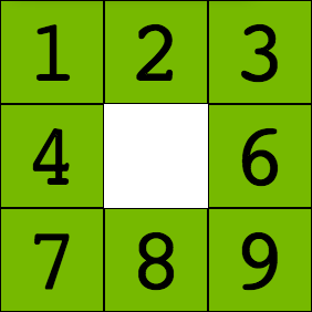
(Visible Hidden)
Height & Width Properties:
The height and width properties allow us to set the dimensions of the content area. You can set height & width using ems, percentages or pixels to name a few. Em values make the size the box relative to the current font size. Percentages make the size relative to its containing box. Pixels allow precise control over the box.
Lets wrap our spans in a div with a class of ‘container’:
<div class="container">
  <span class="box">1</span>
  ...
</div>
Next add the following css:
.container { background-color: yellow; padding: 25px; }You should see something similiar to the following:
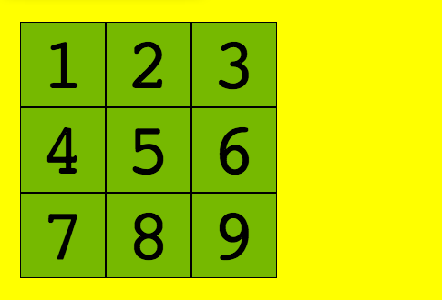
(Span Container)
Notice how the yellow background takes up the entire width since a div is a block element. Lets give it a width of: 280px and a height of 100%
.container { background-color: yellow; height: 100%; padding: 25px; width: 280px; }The div is not taking up 100 percent is it. In regards to the height property you cannot give an element a height that fills the parent element unless the parent element is given an explicit height itself. So we cannot, for example give a div a height of 100%, I mean we can but it will not have the effect you hope it will. What you need to do is give the containing element a height, in this case the body tag. So we add:
body { height: 100%; }If we refresh the page we still don’t see the result we were hoping to see. That is because we also need to give the element that contains the body element a height as well. The html element, so we add:
html { height: 100%; }Finally we see what we had hoped we’d see along.
As stated earlier, padding, borders & margin are applied on top of the content. This means if you want to get the elements actual width and/or height we need to add the content width and any padding, borders & margins. Or we can use a new CSS3 property box-sizing.
Overflow:
If a containing element has a smaller width or height than the contained elements width or height, the content of the containing element will overflow. The overflow property gives us the ability to control the presentation of the overflowing content.
element.style {
  overflow: visible; /* this is the default, other values include: auto, hidden & scroll */
  overflow-x: hidden;
  overflow-y: hidden;
}
Update the code pen and add the following css:
.container { background-color: yellow; height: 280px; padding: 25px; width: 185px; }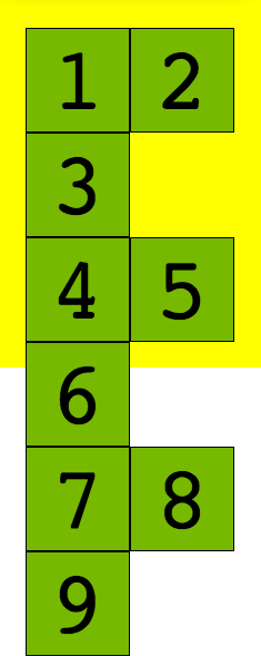
(Overflow)
Notice how the boxes are now overflowing. Add an ‘overflow’ property with a value of ‘hidden’ to the ‘container’ class.
.container { background-color: yellow; height: 280px; overflow: hidden; padding: 25px; width: 185px; }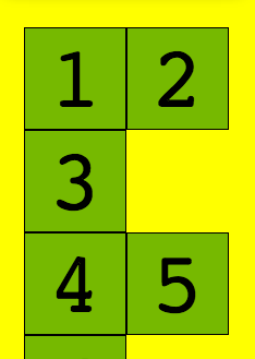
(Overflow Hidden)
Floats:
W3 states: A float is a box that is shifted to the left or right on the current line. The most interesting characteristic of a float (or a “floated” or “floating” box) is that content may flow along its side (or be prohibited from doing so by the ‘clear’ property). Content flows down the right side of a left-floated box and down the left side of a right-floated box.
element.style {
  float: none; /* values include left, none & right with none being the default. */
}
Lets change our boxes implementation up a bit. Replace the html & css from the code pen with the following:
HTML
<div class="container">
  <div class="box">1</div>
  <div class="box">2</div>
  <div class="box">3</div>
  <div class="box">4</div>
  <div class="box">5</div>
  <div class="box">6</div>
  <div class="box">7</div>
  <div class="box">8</div>
  <div class="box">9</div>
</div>
CSS
body { margin: 0; margin: 5px; padding: 0; }
.box {
  background: #76b900;
  border: 1px solid black;
  font-family: monospace, sans-serif;
  font-size: 5em;
  margin: 0 -2px;
  padding: 0;
  text-align: center;
  width: 92px;
}
.container { background-color: yellow; padding: 25px; width: 280px; }
At first what you’ll see is something similar to the follow:
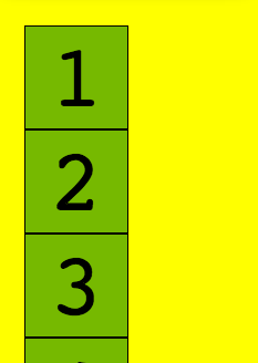
(Div Boxes)
Since a div is a block element, each individual box is on its own line. Next, add the ‘float’ property with a value of ‘left’ to the ‘box’ class. You should see something similar to the following:
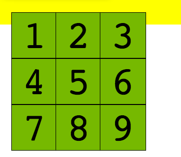
(Float Left)
So what is happening here? Since a float is not in the flow of the document, and the container div does not have a specific height, the container is acting as if it does not have any children. What we need to do here is ‘clear the floats’.
Clearing Floats:
Its common to have to clear floats. This is accomplished by using the clear property. You can use left, none or right. Left doesn’t allow floats on the left side of the clear element, right doens’t allow floats on the right side of the clear element.
element.style {
  clear: none; /* values include: both, left, none & right with none being the default. */
}
ClearFix Hack
.contain-floats:before,
.contain-floats:after {
  content: "";
  display: table;
}

.contain-floats:after {
  clear: both;
}

/* ie6&7 */
.contain-floats {
  *zoom: 1;
}
Lets break the clearfix hack down. Add the following css to the codepen:
.container:before,
.container:after {
  content: "";
  display: table;
}

.container:after {
  clear: left;
}
This is inserting empty text before and after the content inside the ‘container’ div. Setting its ‘display’ property to ‘table’, causing it to act as a table element. Because were using this with the ‘:before’ pseudo element we use ‘table’ instead of ‘block’ to contain the top-margins of child elements. Since we are floating the boxes left I am adding a ‘clear: left;’ to the containers ‘:after’ content. This doesn’t allow floats on the left of it.
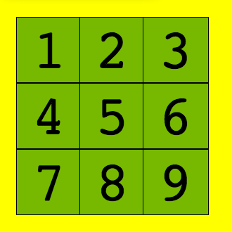
(Float Left/Clear Fix)
Positions Properties:
The position property positions an element in the layout based on an offset value.
element.style {
  bottom: 0;
  left: 0;
  position: static;
  right: 0;
  top: 0;
}
Position property values include:
* absolute: takes the element out of the page flow. Positions it based on the specified offset values
* fixed: like absolute, it is taken out of the page flow. It is positioned based on the offset values relative to the viewport. The element doesn’t move when the page is scrolled
* relative: does not take the element out of the page flow just the visual layer. It lays out the element relative to where it would normally be laid out
* static: default value, element has normal behavior and offsets have no effect.
The offset properties include:
* top: from the top, accepts: em, px, %
* right: from the right, accepts: em, px, %
* bottom: from the bottom, accepts: em, px, %
* left: from the left, accepts: em, px, %
* If offset value is a percentage, its based on its parent container.
Lets see them in action. Add the following to a code pen:
HTML
<div class="container">
  <div class="box box-1">1</div>
  <div class="box box-2">2</div>
  <div class="box box-3">3</div>
  <div class="box box-4">4</div>
  <div class="box box-5">5</div>
  <div class="box box-6">6</div>
  <div class="box box-7">7</div>
  <div class="box box-8">8</div>
  <div class="box box-9">9</div>
</div>
CSS
body { margin: 0; margin: 5px; padding: 0; }
.box {
  background: #76b900;
  border: 1px solid black;
  font-family: monospace, sans-serif;
  font-size: 5em;
  margin: 0 -2px;
  padding: 0;
  text-align: center;
  width: 92px;
}
.container { background-color: yellow; padding: 25px; width: 280px; height: 285px; }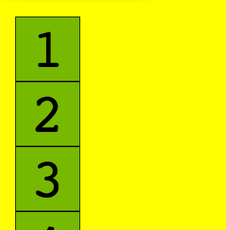
(Position Static)
If we add a position of ‘static’ to the ‘box’ class we can see that nothing actually changes. This is because static is the default. Lets change that now from ‘static’ to ‘absolute’. They are not stacked one on top of the other. We can add a z-index to the ‘box-1’ class and will see that ‘box-1’ is now on the top of the stack.
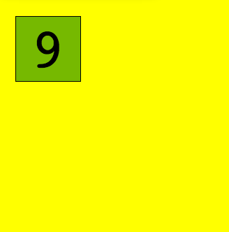
(Position Absolute)
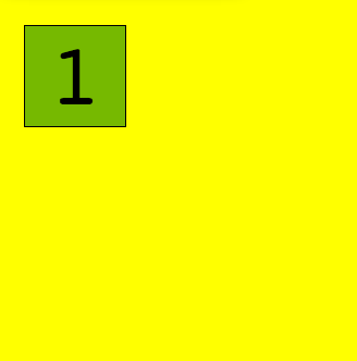
(Position Absolute Z-Index)
.box-1 { z-index: 1; }
(Position Relative)
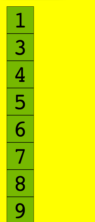
(Position Fixed)
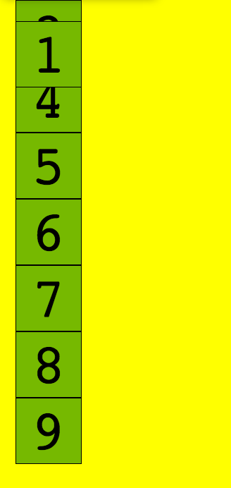
(Position Fixed Scrolled)
Lets position the boxes manually:
.container { position: relative; }
.box-1 { position: static; }
.box-2 { left: 119px; position: absolute; top: 25px; }
.box-3 { left: 213px; position: absolute; top: 25px; }
.box-4 { position: absolute; top: 119px; }
.box-5 { left: 119px; position: absolute; top: 119px; }
.box-6 { left: 213px; position: absolute; top: 119px; }
.box-7 { position: absolute; top: 213px; }
.box-8 { left: 119px; position: absolute; top: 213px; }
.box-9 { left: 213px; position: absolute; top: 213px; }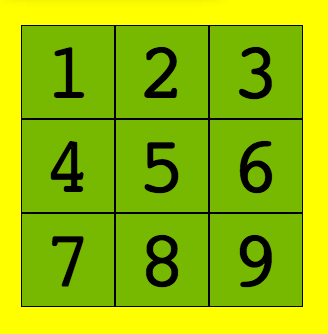
(Position Absolute Manually Stacked)
The Pork Store
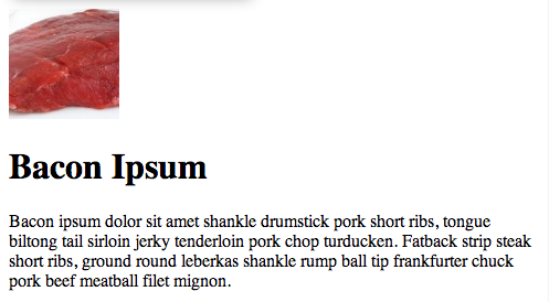
(Bacon Element)
HTML
<div>
  <img src="http://baconmockup.com/100/100" />
  <h1>Bacon Ipsum</h1>
  <p>Bacon ipsum dolor sit amet shankle drumstick pork short ribs, tongue biltong tail sirloin jerky tenderloin pork chop turducken. Fatback strip steak short ribs, ground round leberkas shankle rump ball tip frankfurter chuck pork beef meatball filet mignon.</p>
</div>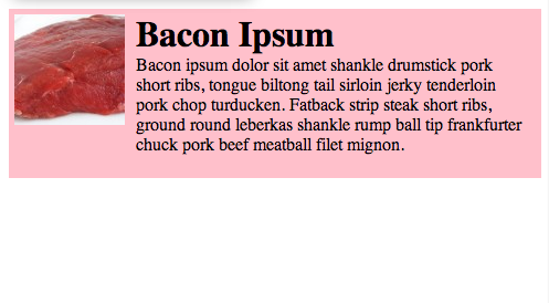
(Bacon Element Styled)
CSS
div { background-color: pink; padding: 5px; }
div:before, div:after { content: ""; display: table; }
div:after { clear: both; }
img { float: left; margin-right: 10px; }
h1 { float: left; margin: 0; }
p { float: left; margin-top: 0; width: 350px; }
Footnotes:
* For a complete description of the Box model, please see the W3C CSS2 Spec http://www.w3.org/TR/CSS2/box.html.
* Code Pen Site http://codepen.io/pen/.
* ClearFix Hack http://nicolasgallagher.com/micro-clearfix-hack/