
With each new project I find myself asking an array of architecture questions. Which server side technology do we use? Is this a dynamic or static website? Does it have a solid launch date already? How many resources do we have for the project?
I've become increasingly consumed with frontend development, not that I mind. As such, I've been doing quite a bit of research on prototyping and responsive web design. Not that the 2 necessarily go hand and hand, but when trying to convince stakeholders that mobile must be thought about early on, visuals help a lot.
So how do I accomplish this? Lets dig into the workflow of the most recent project I led.
Jekyll, "a blog-aware, static site generator in Ruby". Why Jekyll? I like love ruby & I use it for my blog as well as other (mostly) static sites that I've built. It handles the prototyping by quickly generating the site as a whole.
Styling... That's a no brainer, write some clean, well organized CSS yeah? Well, almost... lets use SASS instead! Why sass over plain css? Who doesn't love a good preprocessor is what it really comes down to. A lot of great articles have been written on this topic so I'll just list a few of my favorite reasons:
- Because this is ugly:
p.green-nv { color: #76b900; } - and this is pretty:
p.green-nv { color: $nv_green; }
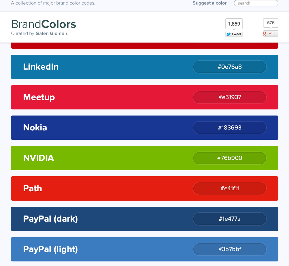 Not to mention new developers don't like asking "Hey what is our brand color's hex value" a bunch of times (until they write it down or remember it) as much as I don't like answering it. Though it became easier to just point them to Brand Colors, thanks @galengidman for adding NVIDIAs' to the site.
Mixins! Have you heard of mixins! It was a dream come true when I found out about these little things of magic. You know what, I'm not even going to ruin the surprise for you if you don't know what mixins are, do yourself a favor and google it.
Ok, so not an exhaustive list by any means but this is not a post on the benefits of using a css preprocessor. So lets keep moving...
Scripting... What are our options here? Well there's javascript, and then there are languages that compile down to javascript. So javascript coffeescript was the clear winner here. Coming from the rails community I decided to throw that in the mix. "Why use coffeescript over javascript?" isn't as easy as "Why use a css preprocessor instead of plain css?". So in the end it came down to not doing the same things all the time. New project, new techniques? Yeah that works for me. I do encourage reading up on coffeescript though.
Ok, with those questions answered, then I asked will my windows teammates have any issues using my workflow? I personally work on a Mac so obviously everything "just works", but would my windows compadres be so lucky? I decided to wait on fully answering that question. I mean, for the most part, it should work, right?
Initially, I imagined working something like this:
- Developer setups their local environment (which I'll write up directions on, handling the windows case last).
- Check out the project from the repository.
- Run jekyll to generate the site, and test that it works.
- Quit jekyll.
- Find a user story or issue to begin working on.
- Read and understand the requirement (ask questions if you are unsure of anything).
- Familiarize yourself with the codebase, sass imports, coffeescripts, but most importantly the coding style.
- Create a feature branch and start hacking away.
Quickly I realized adding a Gemfile to the project would make life easier on anyone jumping in. So a Gemfile was born.
  gem 'classifier', '~> 1.3' # jekyll dependency
  gem 'compass', '0.12.2'
  gem 'directory_watcher', '~> 1.4.1' # jekyll dependency
  gem 'jekyll', '1.0.0.rc1'
  gem 'liquid', '2.5.0' # jekyll dependency
  gem 'maruku', '0.6.1' # jekyll dependency
At first I was using a separate process to compile the assets (styles & scripts). Compass for sass to css & watching my coffeescript directory to compile to javascript. Actually I am lying a bit, I really use livereload which is great. Compiles your sass, coffeescript & even reloads the page for you. Of course great for me, but not so great for my windows comrades. Guard? Yup, Guard! So now I needed a guard file. No problem, but first lets add our guard gems.
  gem 'guard', '1.7.0'
  gem 'guard-coffeescript'
  gem 'guard-compass', '0.0.6' # guard dependency
  gem 'guard-concat'
  gem 'guard-livereload', '1.1.3' # guard dependency
  gem 'guard-process', '1.0.5' # guard dependency
  gem 'guard-sass'
  gem 'guard-uglify'
  gem 'rb-fsevent', '0.9.3' # guard dependency

  group :windows do
    gem 'wdm'
  end
...and now my guard file:
  # Using compass instead of guard-sass
  #guard :sass, :output => 'stylesheets/_compiled' do
    #watch(%r{^stylesheets/_sass/.+\.scss})
  #end

  guard :compass, :output => 'stylesheets/application' do
    watch(%r{^stylesheets/_sass/.+\.s[ac]ss})
  end

  guard :coffeescript, :output => 'javascripts/_compiled' do
    watch(%r{^javascripts/_coffee/.+\.coffee$})
  end

  # Use this for development
  guard :concat, type: 'js', files: %w(_application _simple-pub-sub _modal _gallery _video _navigation _notify _rate-this _alert _misc _play-pc-games), input_dir: 'javascripts/_compiled', output: 'javascripts/application'
  # Switch to this for production
  #guard :concat, type: 'js', files: %w(_application _alert), input_dir: 'javascripts/_compiled', output: 'javascripts/_compiled/application.js'

  # guard-process is not working on windows atm
  #guard :process, :name => 'Uglify', :command => "uglifyjs javascripts/_compiled/application.js -o javascripts/application.min.js -c dead_code=true,drop_debugger=true,unused=true,join_vars=true -m -r '$,require,exports'" do
    #watch %r{javascripts/_compiled/application.js}
  #end

  # Using livereload instead of guard-livereload
  #guard :livereload, :grace_period => 0.5 do
    #watch(%r{^_site/.+\.(css|js|html)})
  #end
Now let me create a layout and start banging away. Basic layout set, lets create our index page. Add some bacon and kittens to the index page. Awesome! Ladies and Gentleman, lets move this to a dev server yeah? Build script? Sure. A lot of overhead? You bet. Start pulling in developers and expect them to be excited? Ha... Ha...
Ok, let's tie this together with some rake tasks. We will have to watch guard (watch:guard) & jekyll (watch:jekyll) for changes, create pages (:page), build (:build) & deploy (:deploy). Great! Great? Yeah, Great! At least I think so. Oh wait, dont we need wireframes? Design comps?
Hey Creative, how are things over on your island? Ok, lets talk grid...
This is where things get responsive err interesting. Prior to a solid set of comps, I was mostly organizing the project. Breaking up styling components like fonts, colors, basic classes I like to reuse, etc... into separate files. With the comps came time to create a grid. For that I use gridulator. A great starting point, you can even use the png's to overlay on the psd's. Ok, but gridulator spits out pixel widths, don't we use percents? Yes, here is an example of converting the pixel widths from gridulator to percentages.
Heres our grid, everything here should be pretty self explanatory.
  /* GRID http://gridulator.com/
   * Width: 1280px
   * Columns: 8
   * Column width: 110px
   * Gutter: 40px
   * Margin: 60px
   */
  .grid-1 { width: 110px; }
  .grid-2 { width: 260px; }
  .grid-3 { width: 410px; }
  .grid-4 { width: 560px; }
  .grid-5 { width: 710px; }
  .grid-6 { width: 860px; }
  .grid-7 { width: 1010px; }
  .grid-8 { width: 1160px; }

  .grid-1, .grid-2, .grid-3, .grid-4, .grid-5, .grid-6, .grid-7, .grid-8 {
      margin: 0 40px 10px 0;
      float: left;
      display: block;
  }

  .grid-container { margin: auto; max-width: 1160px; width: 1160px; }
  /*****************************************************************************/
Now here is our responsive grid:
  /* Responsive Grid */
  .grid-1  { width: 9.48275862069%; }   /* 110px */
  .grid-2  { width: 22.413793103448%; } /* 260px */
  .grid-3  { width: 35.344827586207%; } /* 410px */
  .grid-4  { width: 48.275862068966%; } /* 560px */
  .grid-5  { width: 61.206896551724%; } /* 710px */
  .grid-6  { width: 74.137931034483%; } /* 860px */
  .grid-7  { width: 87.068965517241%; } /* 1010px */
  .grid-8  { width: 100%; }             /* 1160px */
  .grid-1, .grid-2, .grid-3, .grid-4, .grid-5, .grid-6, .grid-7, .grid-8 { margin: 0 3.44% 1% 0; }
  .grid-container { width: 90%; }
  /*****************************************************************************/
How did we come up with this? Lets start with the .grid-8 class, pretty simple we take the 1160px (1280 width minus the left & right 60px margins) and divide by itself (1160), then we multiply by 100 to get our percent. In this case 100%.
Now for our .grid-7 class, take our target of 1010px and divide that by our context 1160px. We get 0.870689655172414 give or take a few digits... multiply that by 100 for 87.068965517241%.
We do that for the remaining grid classes, target divided by context multiplied by 100. The only place I deviate from this is at the 320x480 media query. There I just make all the grid classes take up 100% of the width.
.grid-1, .grid-2, .grid-3, .grid-4, .grid-5, .grid-6, .grid-7, .grid-8 { width: 100%; }A lot of detail goes into the implementation, and for the sake of keeping this a post instead of a "from photoshop to website" book (though keep an eye out because I do have plans on writing just that) I'll have to stay high level. This is where working closely with the creative team really came into play. There was just a lot of back and forth, finding breakpoints, changing more of the layout, and comps still weren't even finalized yet.
Some of the challenges faced were not really in any particular order:
- Dynamic text over images.
For instance on the features page originally, we had the descriptive text and underneath that the image. As you view this on a more narrow device the heights on the paragraphs would change drastically. This caused misalignments in the rows. So now you have to decide if you want a fixed height on the paragraphs. This could work, only some have less text than others so you're left with a lot of space between where the text for one paragraph starts and the matching image begins. This is amplified when you get down to a mobile phone. Now some images look like they belong to other descriptions. After mocking up a few implementations, it was just swapping the image and text that won out. My favorite as well. - Bring the team up on the workflow.
Not many people really like change. Especially developers, most of which can be very lazy at times (present company included). Plus skill sets and learning styles differ greatly. Throw in a geographically dispersed team, and these things can make for a lot of resistance. Sometimes the overall picture is enough to motivate and inspire. Other times having a lot of patience helps. Advocating and not dictating. Just breaking tasks down as small as possible so that your teammate can achieve and build up on some small wins. - A responsive gallery slider and modal windows.
This was a tricky one. After the image gallery was built it got some negative feedback from stakeholders. Two major issues were found, both having to do with the responsiveness. For the modal popup, if you switched from portrait to landscape or vice versa it outright looked like crap. Part of the background mask was missing, the modal was either too large or too small after the change in orientation. This was an easy decision for me to make, on resize of the window, close the modal. Let the user open it again and the modal would be correct to the screen size. The second issue had to do with the slider implementation. The site is responsive, so if a user has scrolled to the last image, and they change the devices orientation, are they still on the last image? So I'm on my Tegra 4 tablet, checking out shield.nvidia.com in portrait view. I get to the gallery slider, tap the next/forward button a few times and get to the last image. Now for whatever reason I flip my tablet to landscape. Well the image is not possibly a little further left than it should be and you have some empty space between the last image and the next/forward button. In order to handle this I just wrapped back around to the first image. Not the greatest implementation I have to admit, but I liked it. Stakeholders however, did not. Not at all! Time to create a responsive slider (I plan to open source it at some point). - Supporting older browsers.
Why, oh why doesn’t everyone just upgrade their browser. I mean, at this point, outside of business applications the browser is the most important application. You'd think that anyone using IE < 9 would've fallen into an abyss by now, but nooooo. What browsers do you support? IE6 is down to 6.3% (still way higher than it should be), drop it. IE7 is below 1%, woohoo! Drop it. IE8 still has above 10%, if it were up to me I'd drop it. We actually do support IE8 though. Sites like the above are fun and opinionated in some cases, and spot on as well. However, the key is to monitor your web traffic across different web properties and make educated decisions based on your own unique user base.